The dashboard builds itself
A weekend prototype: an analytics agent that writes the SQL, runs it, and draws a dashboard in a design system I built, on the fly. What generative UI is, and where the boundary has to go.
Ask the prototype analytics agent I built about a game, and it doesn’t answer in a paragraph. It writes the SQL, runs it against a database of made-up data, and draws a dashboard that wasn’t there a second before. “What does my daily revenue look like” comes back as a trend line. “Where are my paying players, and how does session length vary by platform” comes back as a donut and a bar chart, side by side. I never built those screens. The model assembled them in the moment, out of a small set of pieces I handed it, and each one looks like it shipped with the rest of the design system.
This is generative UI. Not a model writing the text inside an interface someone already designed. A model generating the interface itself, live, from what it was asked. The idea isn’t mine and it isn’t new. I built this version for a made-up arcade game, on synthetic data, mostly to find out what it takes to make generative UI you’d actually trust to render on its own. The answer turned out to be less about the model than I expected.
What the model actually returns
The thing that makes any of this safe is that the model never produces UI. It produces a description of UI. A small chunk of JSON: a type, some props, maybe some children. { type: "Metric", props: { label: "Revenue", value: "..." } }. My client reads that and maps it to a real component from the library. The model never writes CSS. It never picks a color. It never lays out a raw div or invents a font size. It picks from names I defined, and the client owns what those names render to.
That one constraint is what turns “a model that draws interfaces” from a liability into something I’d actually ship. Every screen it generates is on brand because it can’t express anything that isn’t. On brand isn’t something I’m hoping the model gets right. It’s the only thing it can produce.
Where to draw the boundary
So the model draws from a vocabulary. The question is how big that vocabulary gets, and that’s the actual design problem. I tried it at three widths.
The narrow version is a fixed catalog of finished charts, each one bound to a question. A daily-revenue chart. A retention grid. A funnel. The agent’s whole job is to pick the right one and fill it in. This is safe, it’s on brand, and it’s the version most people build first. It’s also rigid in a specific way: the revenue chart only knows revenue. Ask the same agent for daily active users and there’s no chart to reach for, because I never built a DAU one. Every new question needs a new chart. I built this version first and it felt exactly as boxed-in as it was.
The wide version is the opposite. Let the model write actual UI code, components and layout and all. Endlessly flexible. Also the version where I’m reviewing model output before it renders, where a bad generation can break the page or quietly stop matching everything else. The flexibility is real and so is the cost of it.
The version I landed on sits in the middle, and the fix was to stop building charts that know what they’re about. Instead of a revenue chart and a retention chart, there’s one TrendChart that renders any series. Point it at revenue, at players, at a retention curve. Same component, same code.
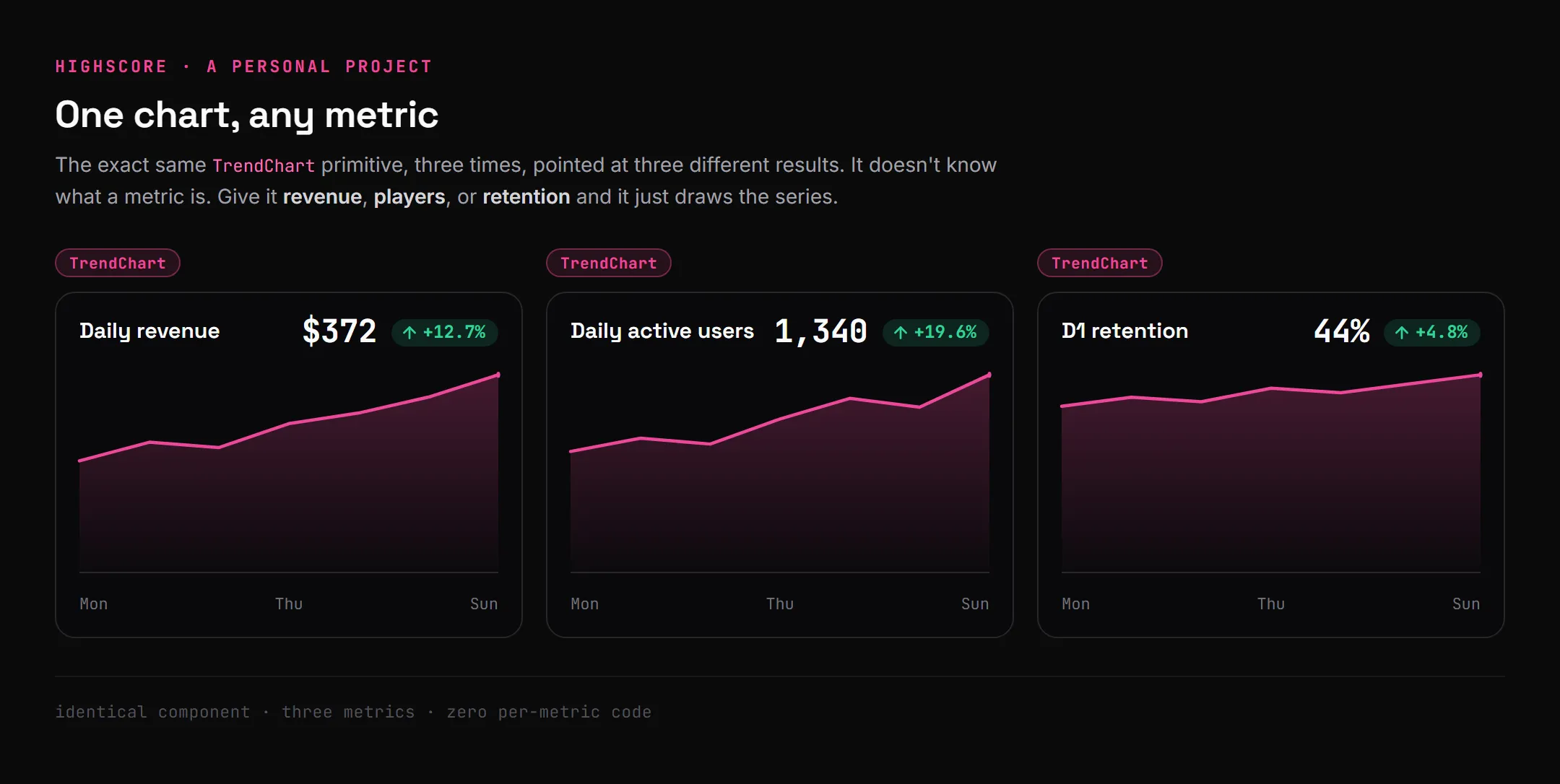
The same chart, three metrics. It never knew the difference. That’s the whole unlock: the chart stopped being about a metric and became a way to draw any metric.
So the vocabulary is just primitives, generic parts the model composes. A Card, a Stack, a Grid for layout. A Metric, a Badge, a Table to show a value. A TrendChart, a ShareDonut, a BarChart that each take any data. All of them bound to a set of design tokens, so spacing and color and type aren’t the model’s to choose. The model nests a couple of metrics and a chart inside a card it assembled itself, and the result is something I never designed but still can’t go off brand, because every piece it used was already mine.
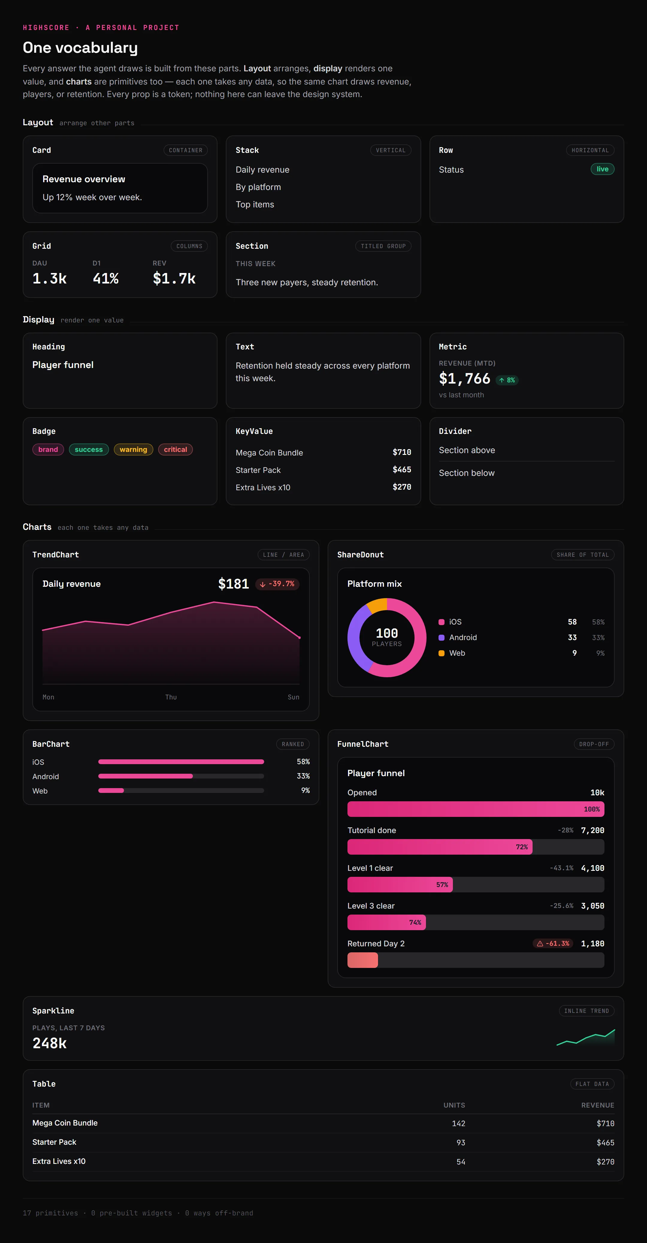
The whole vocabulary. Layout arranges, display shows one value, charts take any data. Every prop is a token, so the model can rearrange these all day and never land on something off-brand.
The data has to be live for any of this to matter
The first version of the agent pre-fetched a fixed set of metrics and let the model arrange them. It looked generative. It wasn’t, really. It could only ever draw the numbers I’d decided to pull in advance, which is the catalog problem wearing a different coat.
The version that works lets the agent decide what to ask for. When it gets a question, it writes its own read-only SQL, runs it against the database behind a guardrail that only allows reads (it can pull data, it can’t write a row or change a table), and builds the UI out of whatever rows come back. Ask for daily revenue and it writes the revenue query and draws the trend. Ask for something I never anticipated and it still answers, because the query and the screen are both generated at the moment the question lands.
The guardrail is the same idea as the component vocabulary, one layer down. I’m not trying to predict every query the model might write. I’m defining the edge of what it’s allowed to do (read anything, change nothing) and enforcing it absolutely. Inside that edge the model is free. It can’t get outside it.
Show the work
Generated UI you can’t follow is a problem. If a dashboard just appears, there’s no reason to trust the number on it, including for me. So the agent narrates while it works. It streams the step it’s on, the SQL it’s about to run, the row counts that came back, and then the UI. By the time the dashboard renders, the trace has already shown what it chose to pull, the query it actually ran, and how much data came back.
These sorts of traces, in my opinion, are critical. It’s the difference between a black box that hands you a chart and a tool that shows where the chart came from. The model is still going to be wrong sometimes. The trace is what lets someone catch it being wrong instead of trusting it blind. I’ve come to think observability is the bar a generated interface has to clear before correctness even matters, because a right answer I can’t audit and a wrong answer I can’t audit look identical from the outside.
What it could do
Here’s why I think the pattern matters past a toy. Any analytics surface answers the questions someone anticipated when they designed it. Everyone who wants something slightly different files a request or goes without. A generative surface answers the question the person actually has, in your design language, without anyone building a screen for it first. The long tail of “can I just see X” stops being a backlog.
And analytics is only the obvious case. The same pattern fits any surface where the questions are open-ended but the look has to stay fixed. Onboarding that builds itself around what someone is actually trying to do. A support answer that renders the relevant controls inline instead of describing them. Anywhere it’s worth building the interface to fit the moment, but the moment can’t be allowed to break the brand. The constraint is what makes that affordable. It’s not a bet on the model having taste. It’s handing it a box of your own parts and letting it build.
It’s a prototype I built on my own, a weekend thing, not something I’ve shipped to anyone. The boundary keeps the output on brand. It doesn’t make it well-designed. The agent can still compose something awkward out of perfectly good parts, because constraining the vocabulary solves consistency, not taste, and those aren’t the same problem. And the biggest limitation right now is speed. A static dashboard renders in milliseconds. This one writes its SQL, runs it, then generates the whole interface as a separate step, which is two model round-trips that add up to tens of seconds before the UI appears. In real time that wait is long enough that for a lot of questions it isn’t worth it. Getting it fast enough to feel live is the problem I’d want to solve before this is more than a prototype.
Summary
- The model returns a description, not a drawing. It emits constrained JSON that maps to my components. It can’t pick a color or write a div, so on brand is the only thing it can produce.
- One vocabulary, not a catalog. A chart bound to a question (a revenue chart) can’t answer a new one. One generic TrendChart that takes any series can. The whole system is a handful of primitives, charts included, composed into whatever the question needs.
- The data has to be live. The agent writes its own read-only SQL and builds the UI from the rows. Pre-fetched metrics only look generative.
- The trace is the trust. Streaming what the agent queried and got back is what makes a generated dashboard auditable instead of a black box.
- Constraint buys consistency, not taste. The vocabulary keeps it on brand. It doesn’t make it good. That part’s still on me.
This is the first version that made me believe the pattern is worth more than a demo. The next thing I want to find out is whether the boundary holds when the questions get stranger than the ones I tested it on. I’ll know more once I push it there.